Overview
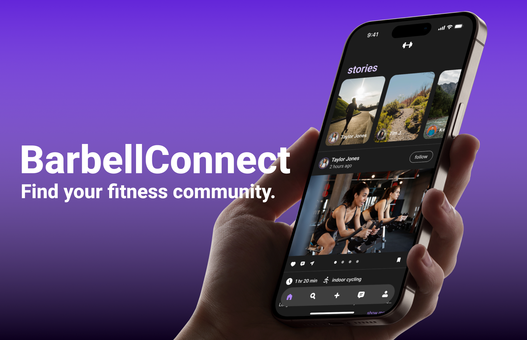
BarbellConnect is an app that promotes the creation and upkeep of fitness communities and was designed through the Lean UX (User Experience) process. The goal of the website is to connect users with others who participate in active lifestyles based on activity, schedule, and location.

Background and Problem
There is a surge of people trying to be more active in their day-to-day lives. One of the ways to stay consistent while working out is finding a fitness community or group that promotes and participates in fitness.
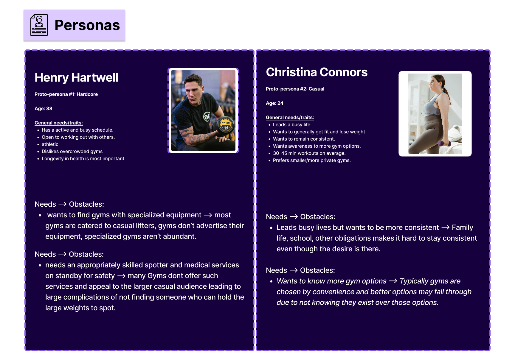
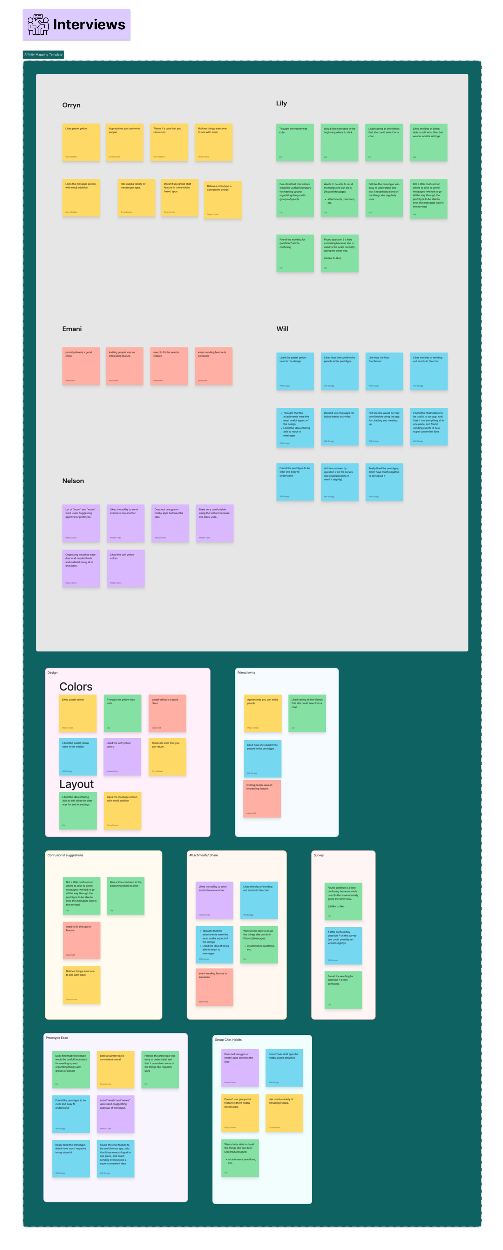
Through our user interviews, we discovered that many do not have people to go to the gym with; therefore, are discouraged from going to the gym at all.
Though many would like to opportunity to find people to go to the gym with, they have concerns about how they would be matched with others.
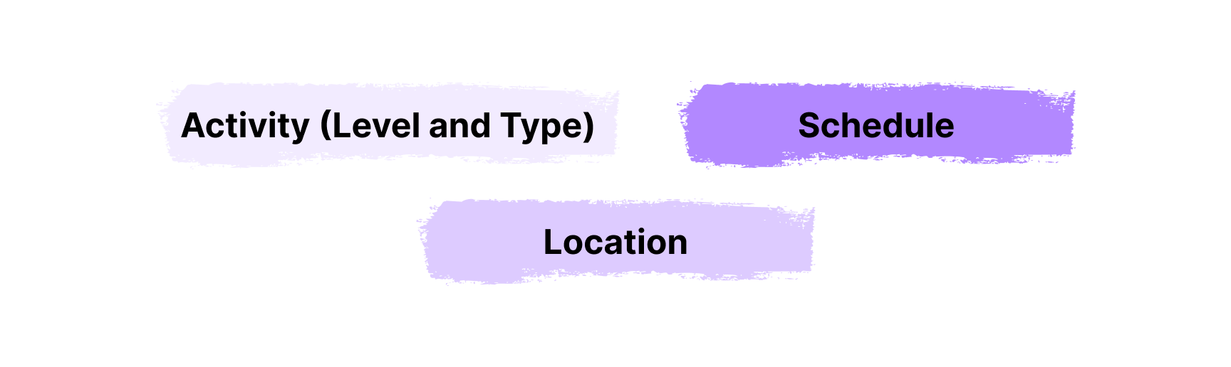
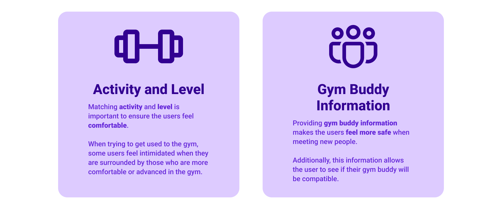
When getting matched on BarbellConnect, our participants were concerned about two main things: what activity (level and type) they will be doing and information on the person or group.
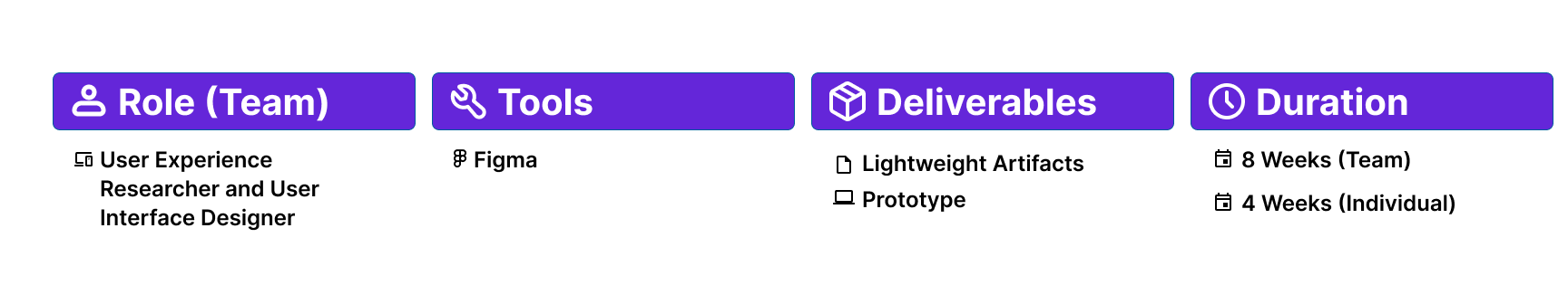
What Was Done as a Team
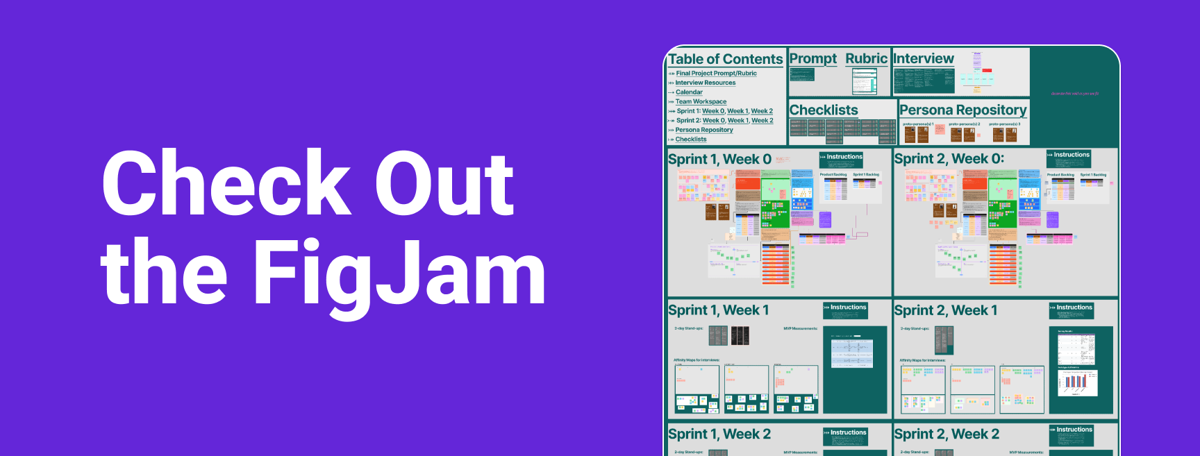
This project was originally a group project and was completed in 2 months.
First Week of Each Month
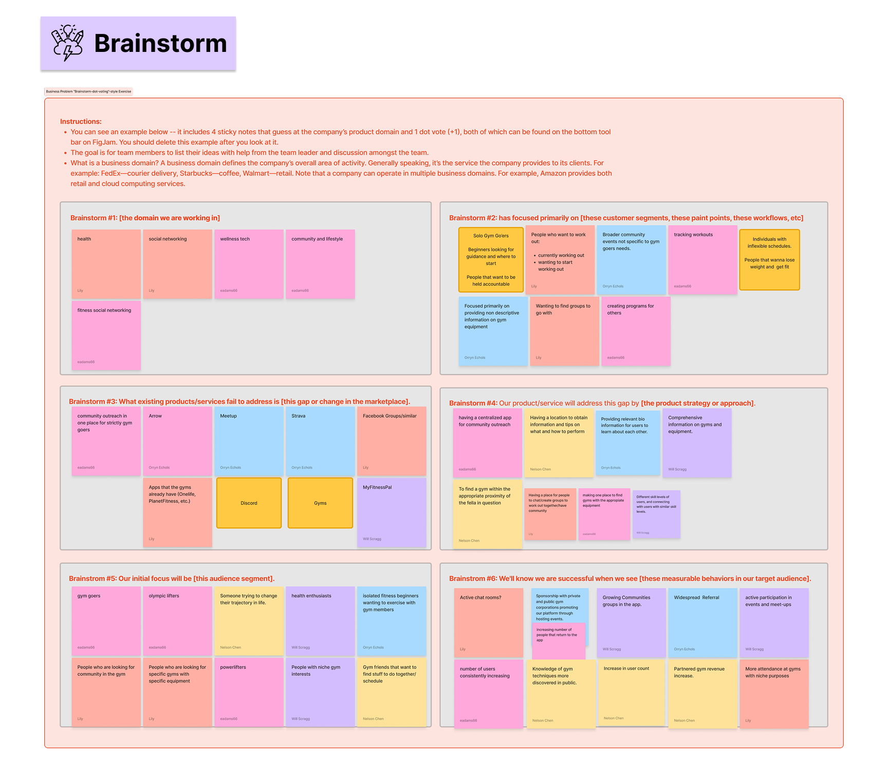
The first week of each month was dedicated to problem solving ideation. This is where we brainstormed, created personas, and came up with hypotheses.
Last 3 Weeks of the Month
The last 3 weeks of each month were dedicated to interviews, user testing, and designing the prototype.
Our Design Solutions
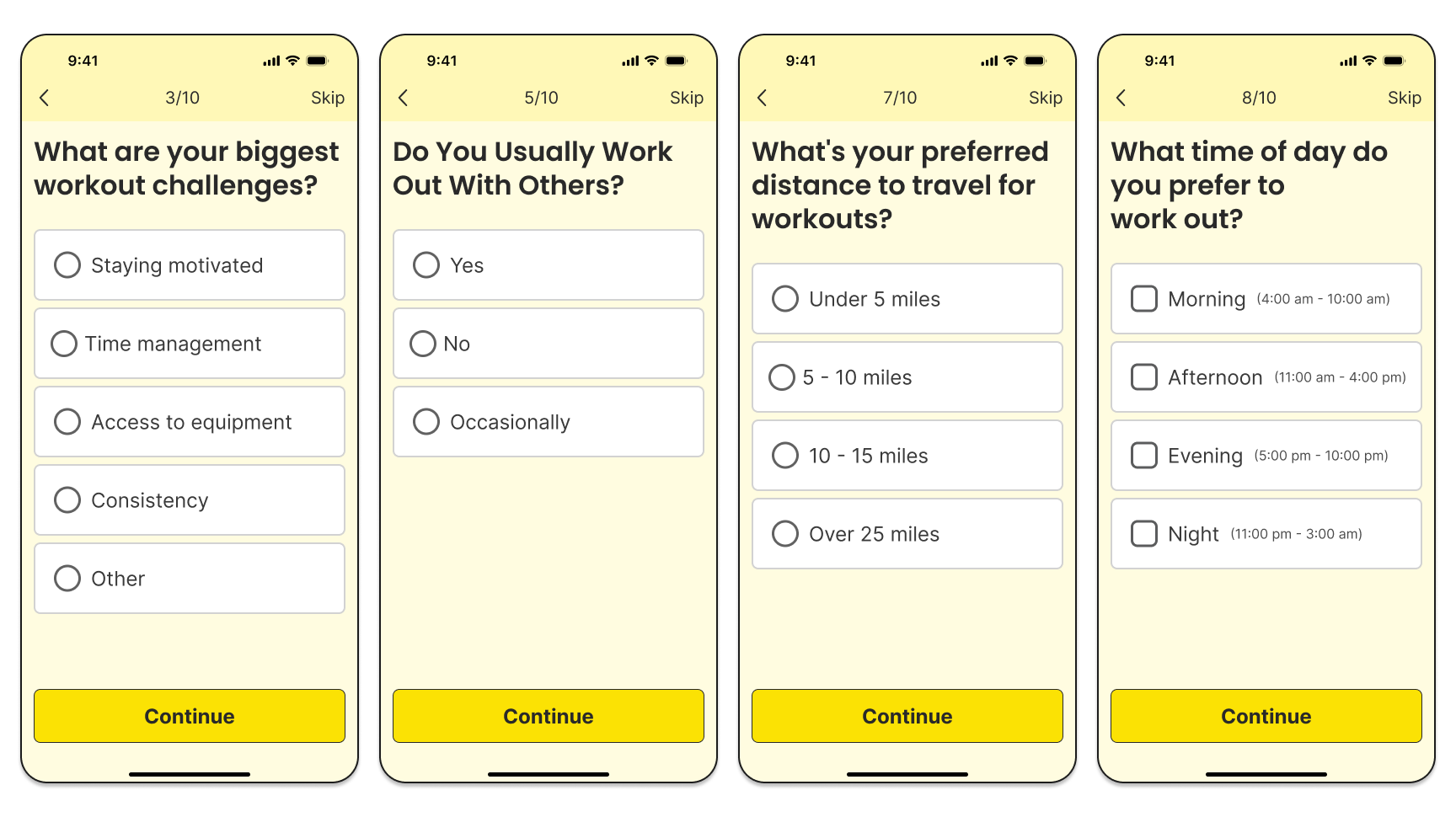
Onboarding Questionnaire
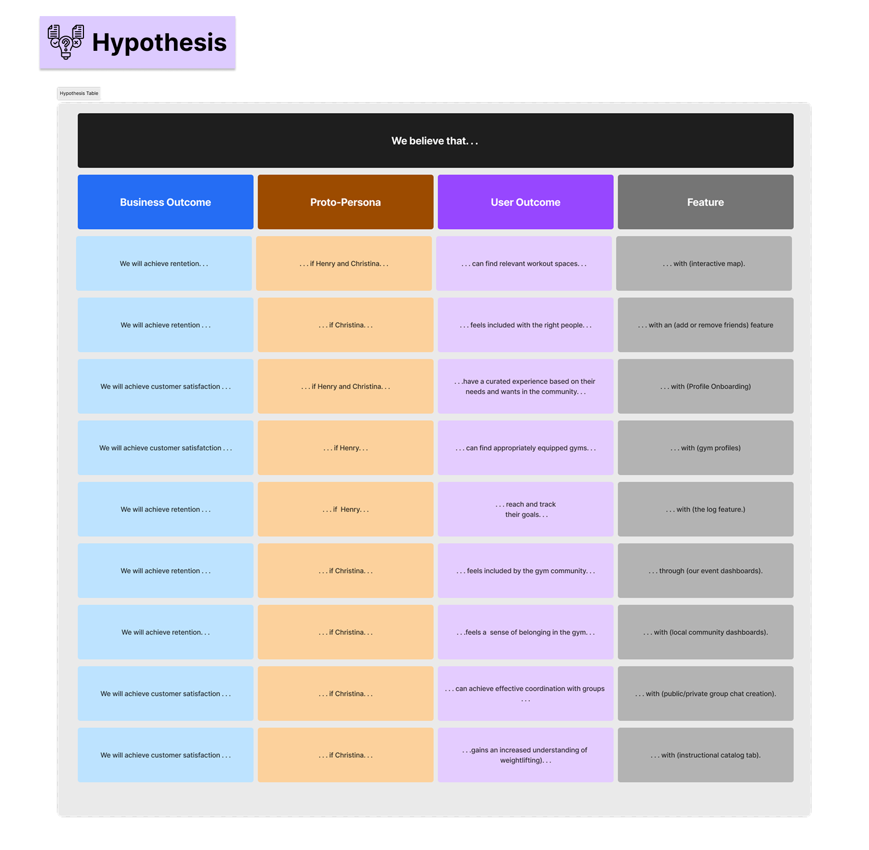
We discovered that BarbellConnect needed to connect our users based on fitness activities, personality types, schedule, and location. We approached this with an onboarding questionnaire that addressed each of these concerns.
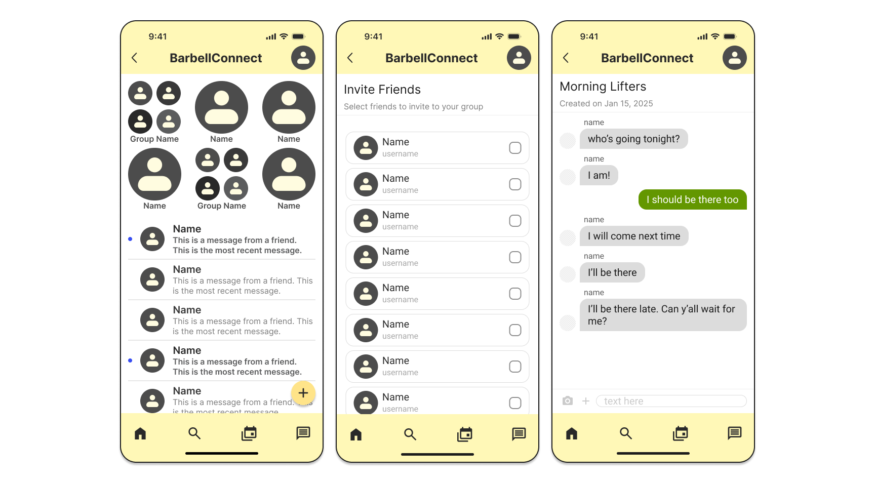
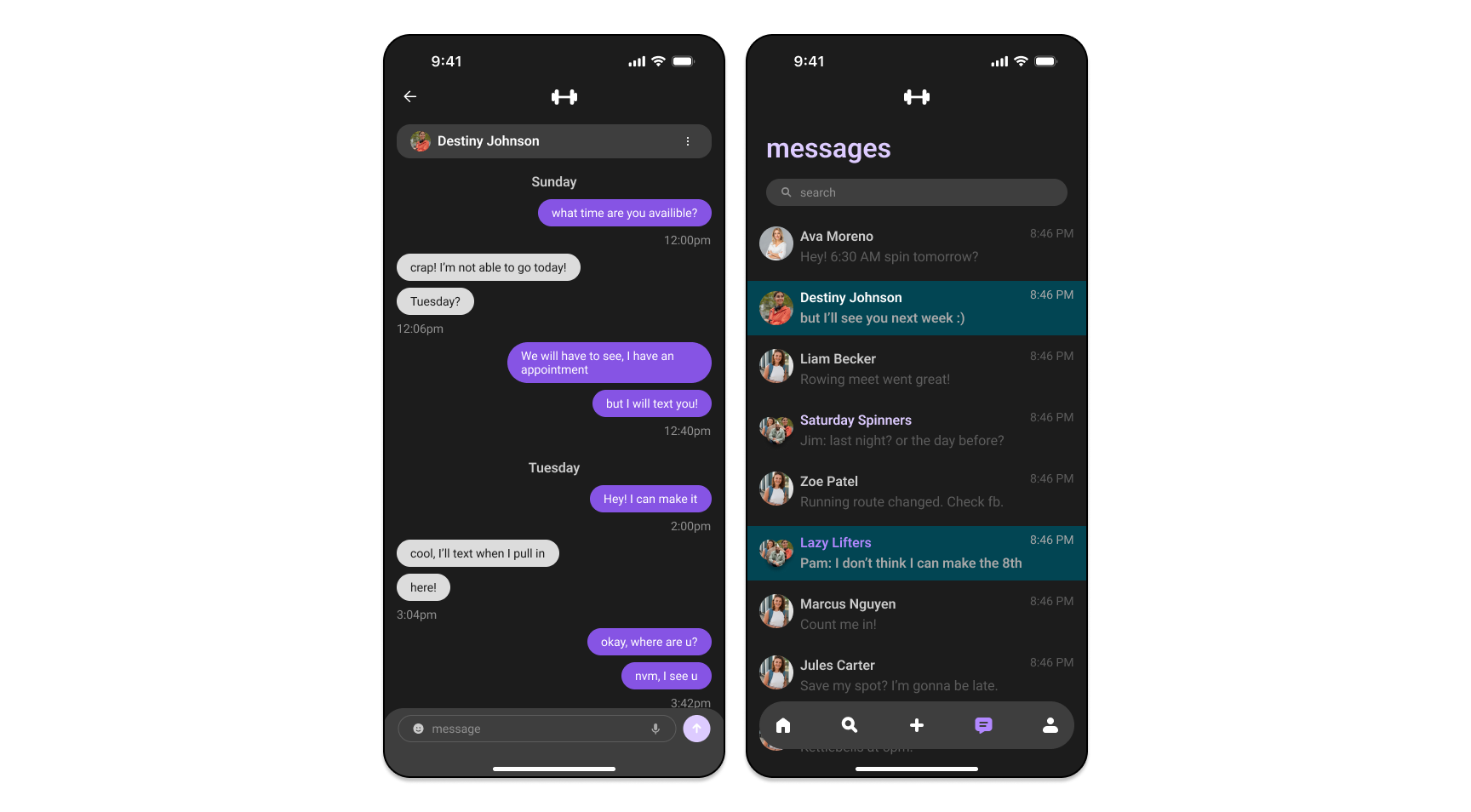
In App Messaging
We also discovered that users would like to connect with others within the app. This is due to the users wanting security and convenience when trying to communicate with gym buddies and gym groups.
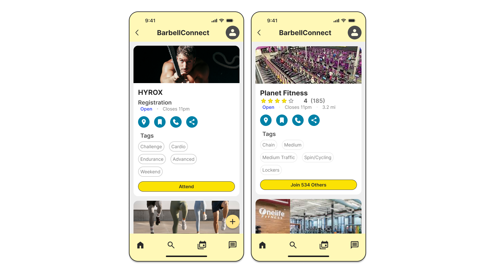
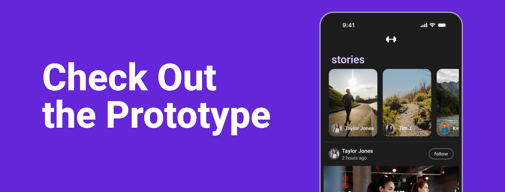
Feed
After conducting user interviews, we discovered that the users wanted to be able to browse the different groups and gyms in their area. This helped them determine what activities they were participating in and where.
What I Changed
After conducting more user research individually, I began to redesign the app to make it fit the audience better.
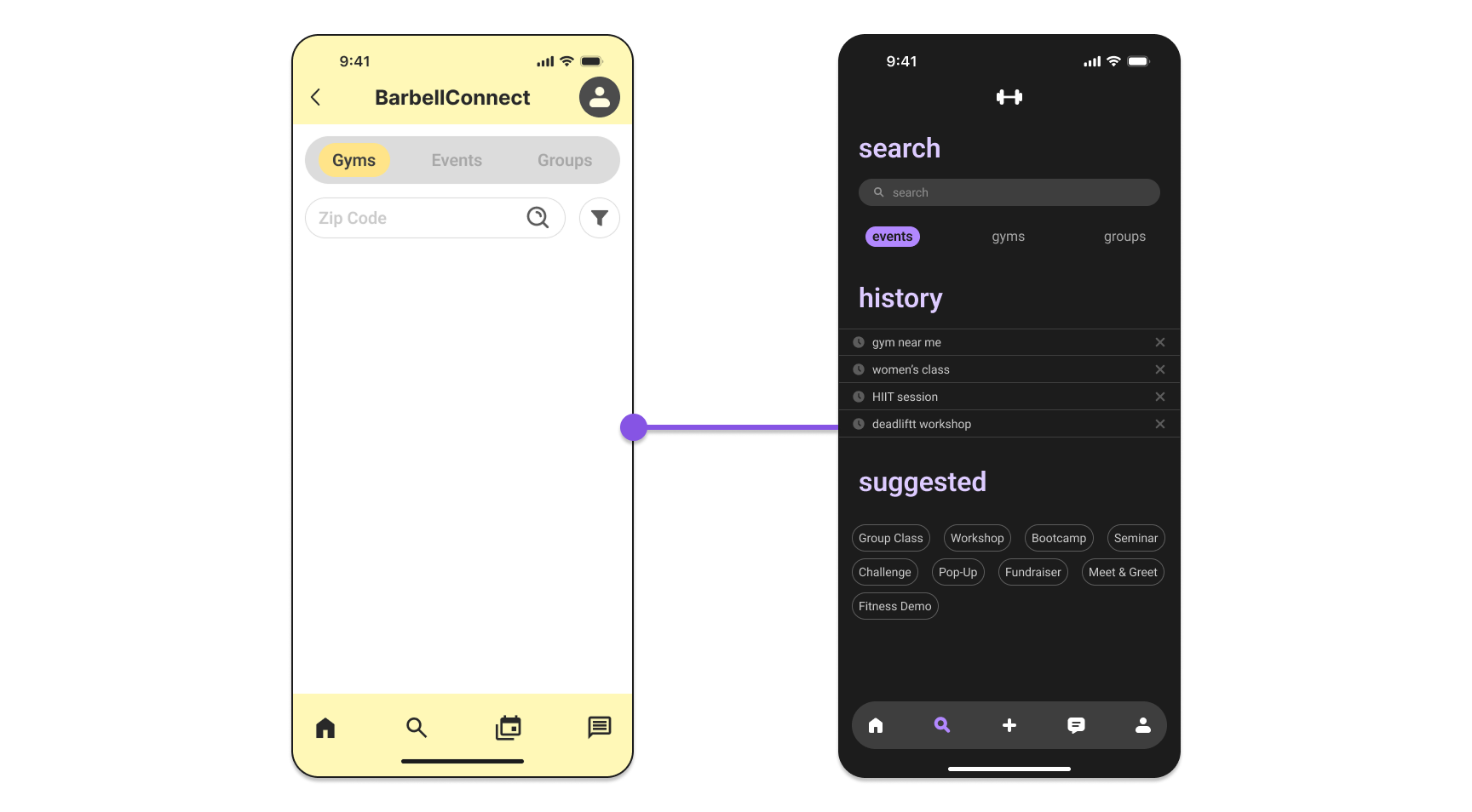
Aesthetic
As shown previously, the app originally was designed in light mode with yellow as the main color. After talking with users, I discovered that gym goers were more likely to use apps in dark mode; therefore, I opted for a darker aesthetic and changed the brand color to a purple.
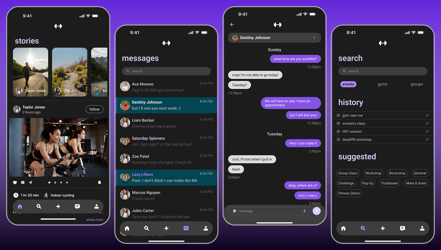
In App Messaging
Another thing I adjusted was the layout of the messages screen. I pulled inspiration from iOS systems to provide consistency for the user and reduce frustration.
Search
Additionally, I updated the search screen by changing the layout and providing a history and a recommended section.
Key Takeaways
While completing this project with my team and individually, I learned the importance of user research. Without user research, you will be unable to create something that truly addresses the needs of the users.