My Designing Process:
Total Design Time: 8 Hours
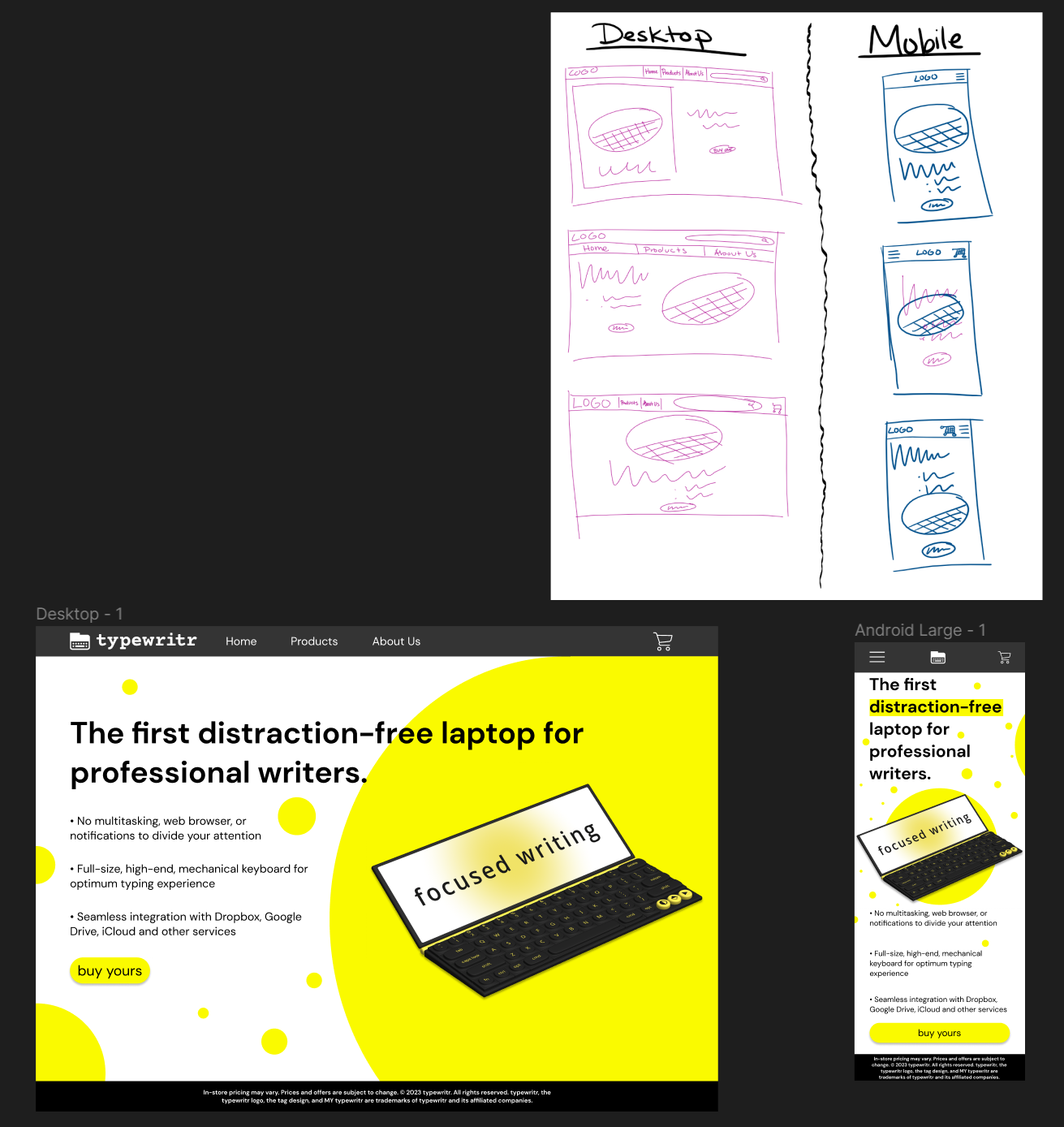
Sketching Phase: I Created two columns, one for the desktop screen and one for the mobile screen. Under each, I created three different iterations of what I thought would work with the images provided.
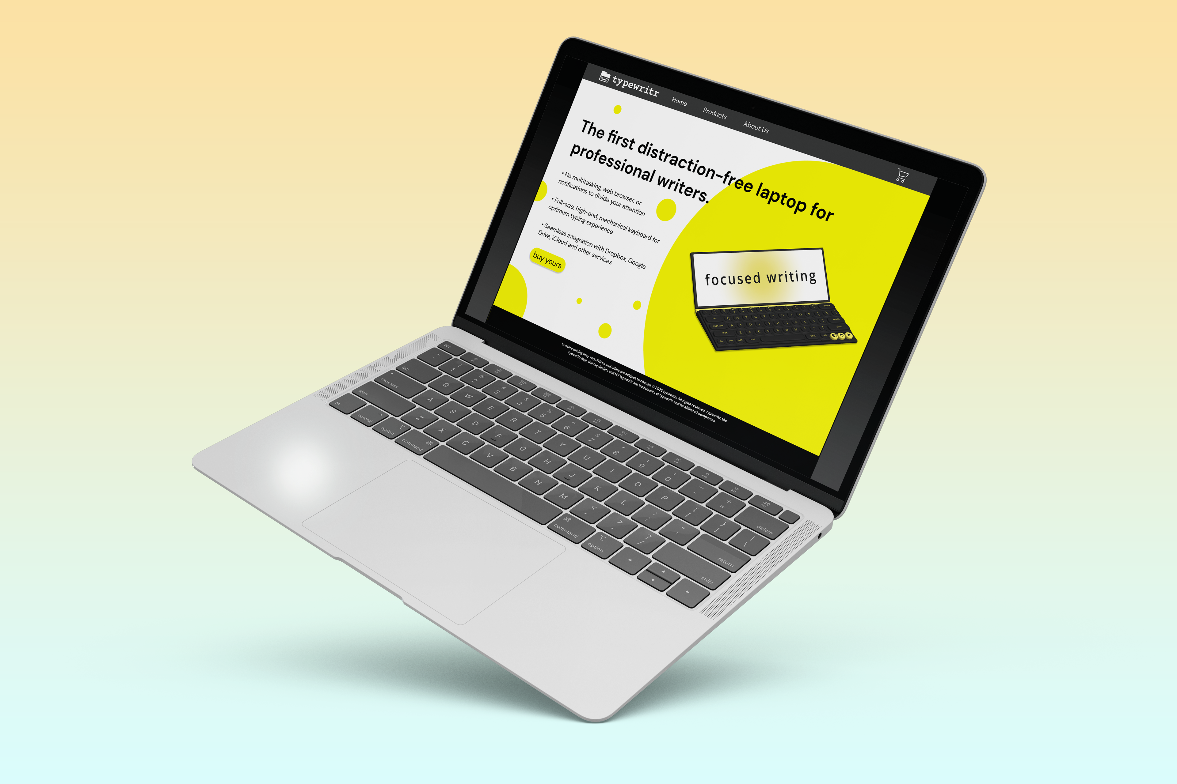
Desktop Vs Mobile: The assignment was to create two different screens that adhere to the standards of Desktop and mobile.
For the desktop, I dedicated half of the screen to information and text and left the other side for the image.
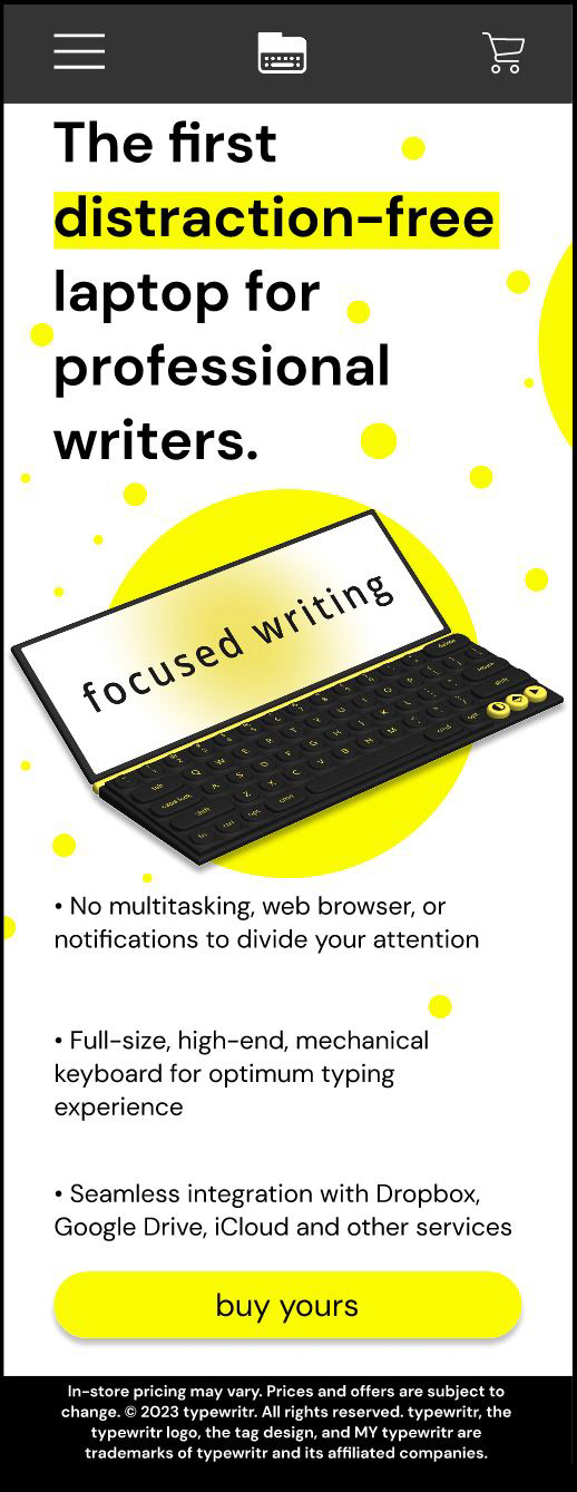
For the mobile screen, I stacked the elements I already created to better fit the narrow screen. I also compressed the menu options into a "hamburger menu" and chose the alternative logo without the text to reduce visual clutter. Additionally, I made the CTA (call to action) Button a lot longer to conform to conventions I saw on other platforms.
Constant Reference: On the same screen, I had my sketches in Figma, that way I would have a visual reminder of what my baseline was going to be.
Add Ons: After I was done formatting everything, I felt like something was missing. I decided that there was too much white space for this landing page to look enticing to the user; therefore, I used the yellow that was provided to me and made some circles to add emphasis to the device and I also used it as a highlighter effect on the mobile screen.
Inspiration:
- Research: I looked up different websites that might sell similar technology to this product (like Walmart, Best Buy and Amazon) to try to get a feel for how they market their products.
- What was Provided: The bootcamp that I worked with provided all of the images, fonts, logos and colors I was required to work with for this assignment. That way, I could focus on my formatting skills.
- Target Audience: The product is a distraction free laptop for writers. These writers could be anybody from any group; therefore, I tried to keep in mind the different conventions I needed to follow to keep the landing pages as user-friendly as possible. Conventions such as: The size of the buttons, the location of the menu options, the use of the shopping cart icon, etc. Being conscious of these conventions makes the design less likely to cause frustration with users.