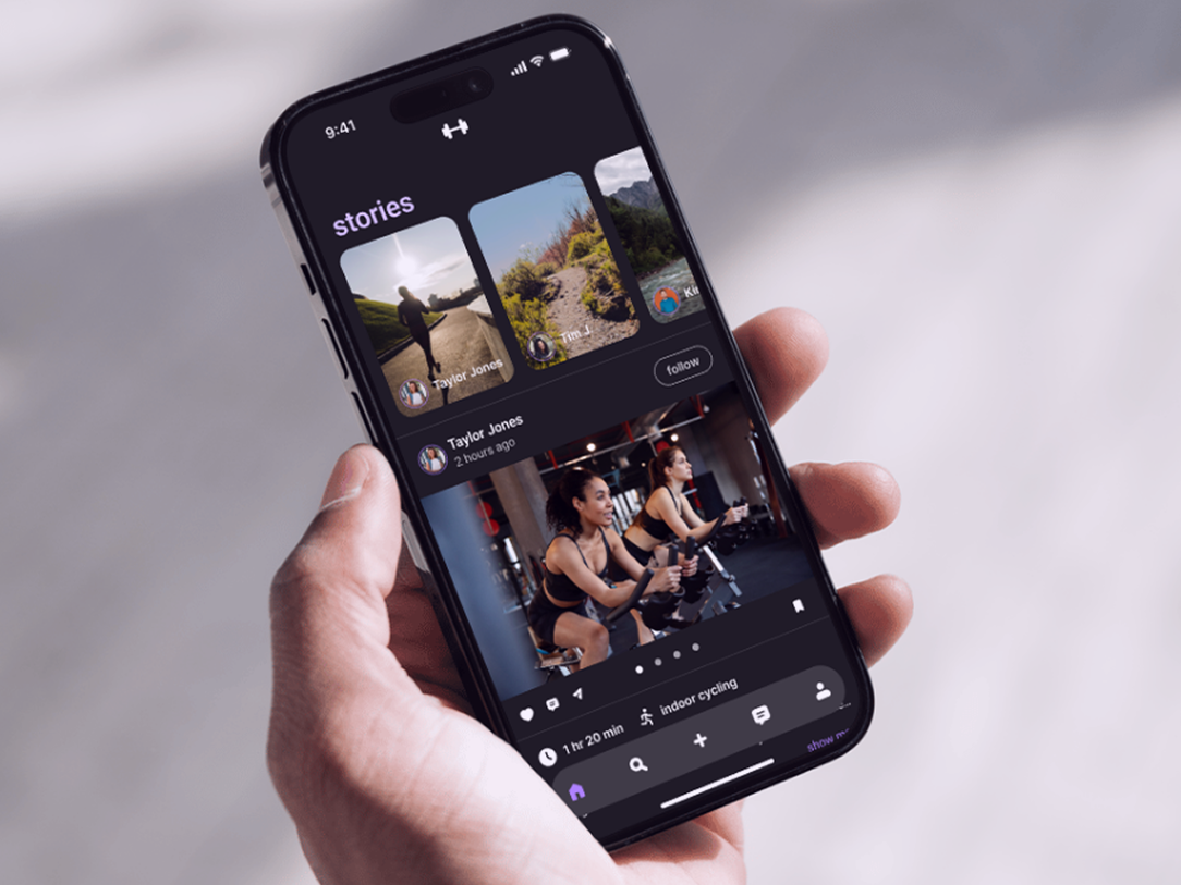
Sketching Phase: I used inspiration from other e-commerce websites and apps to create my app. Additionally, I used the layout from a past project to get me started and try to save time.
Constant Reference: On another tab I had my style tile open with my sketches to keep myself honest and hold myself accountable to the brand.
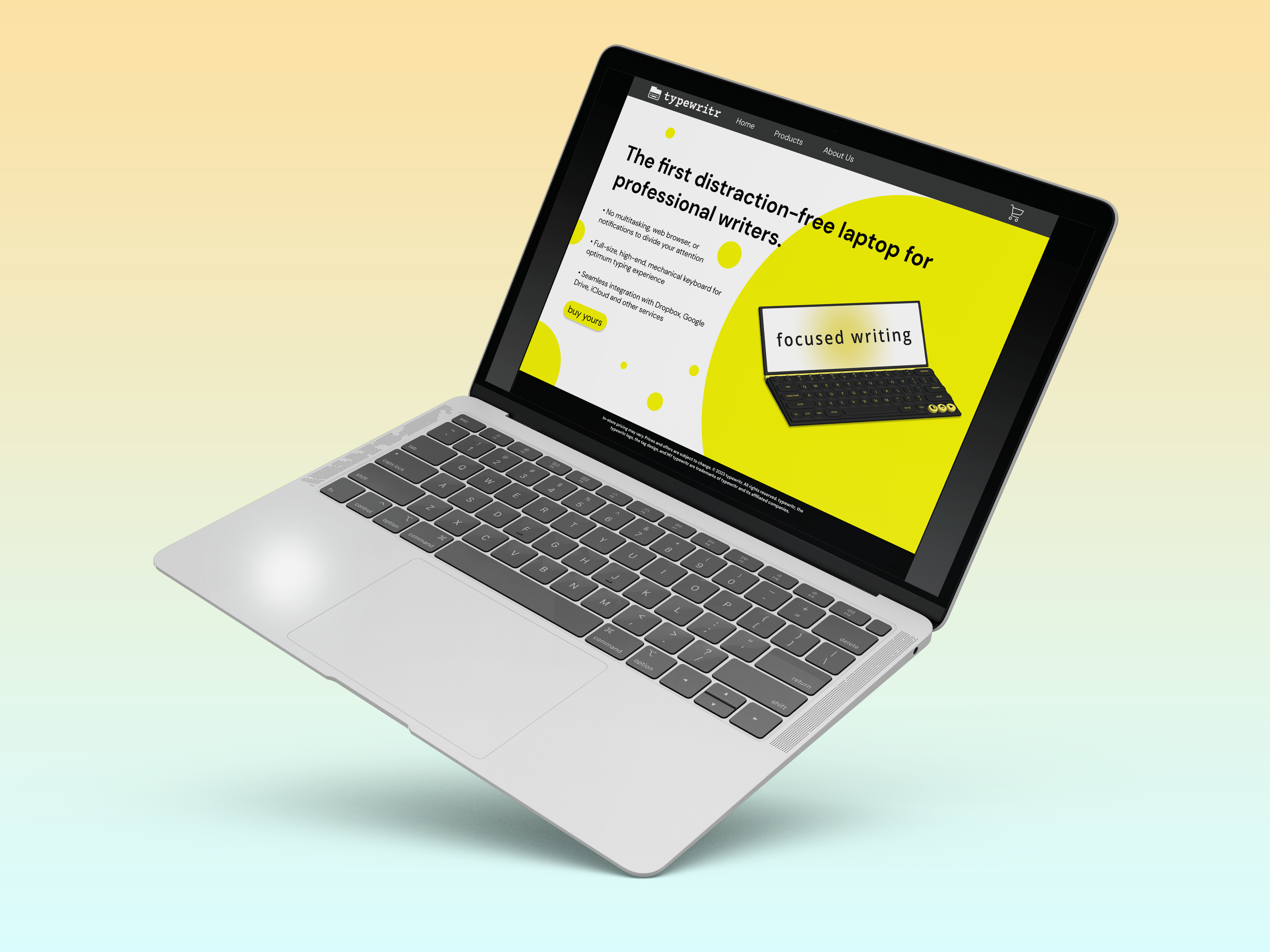
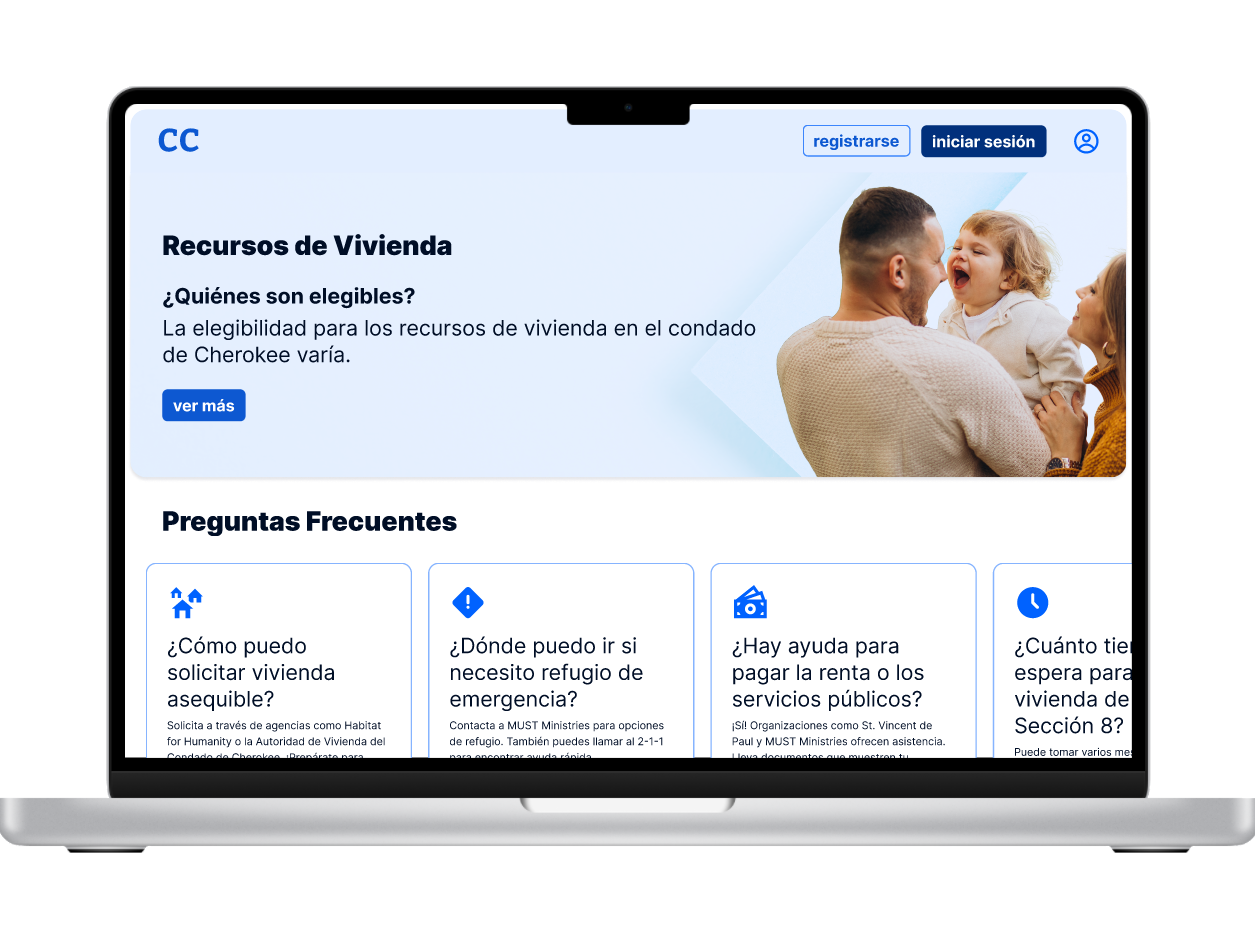
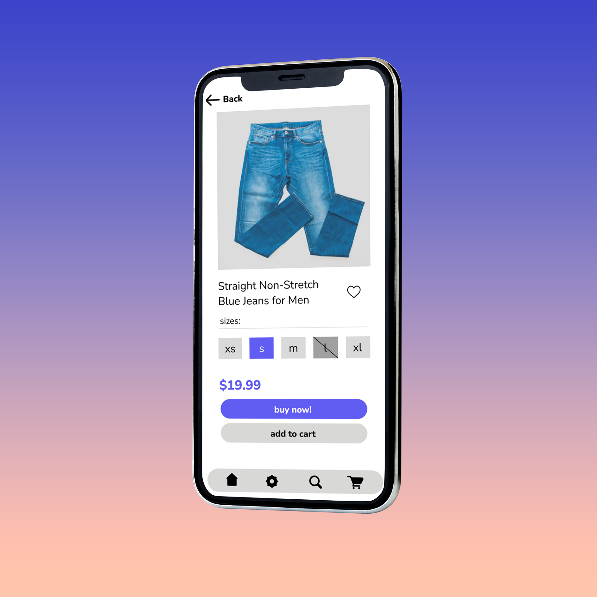
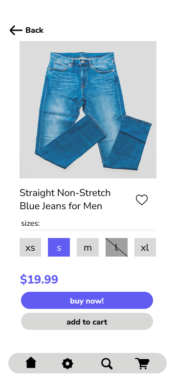
Item Screen: For the item screen I tried to make it look like a mix of what I saw on Old Navy and Amazon.
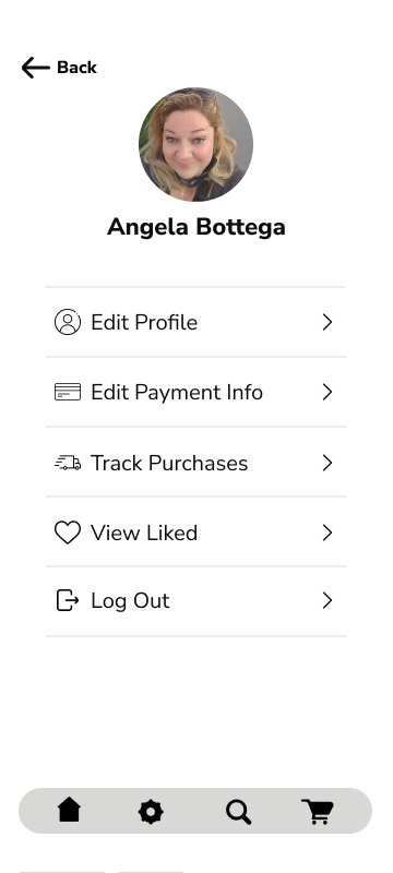
Profile Settings: When making the profile settings, I was thinking of the Amazon app and tried to incorporate the tracking for the shipments and I also thought, instead of a Wishlist I could add something like a liked list similar to TikTok.
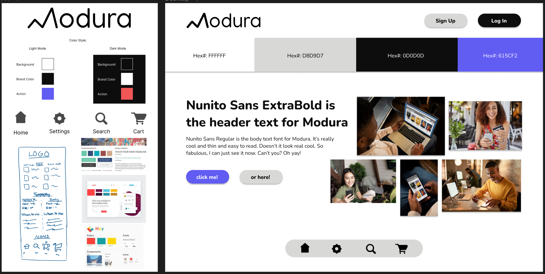
Step One: I created a logo
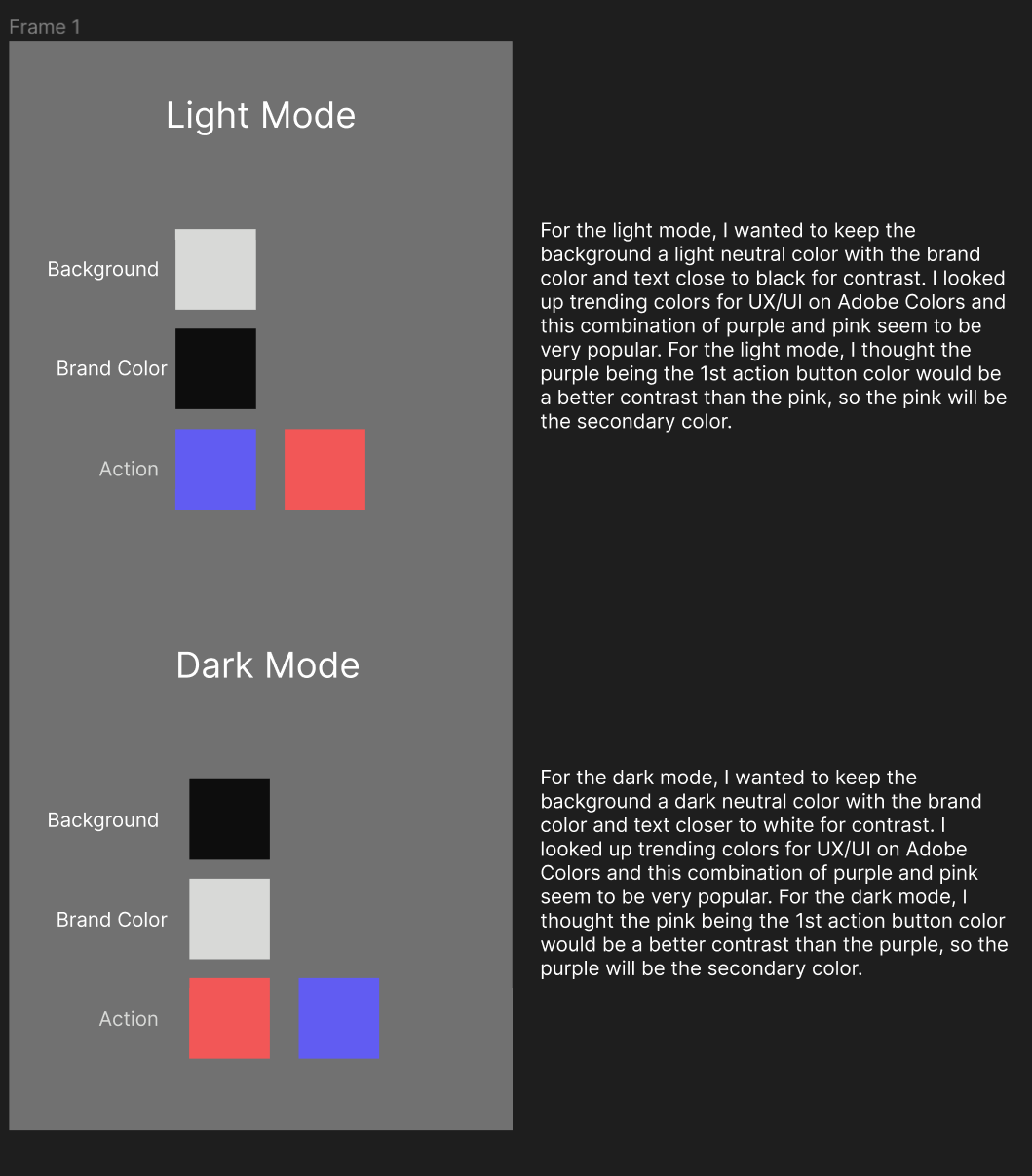
Step Two: I chose my colors and fonts
Step Three: Created a style tile (including the buttons and inspiration of other sites)
Step Four: Then sent my first design out for review
My mentor wanted me to change some of the colors of the buttons, make the icons more simple on the profile page and make it easier to identify when you have selected an option or if an option was out of stock.
Target Audience: Young Adults Ages 18-25 who would be on the search for clothes that are appropriate for their new corporate jobs.
Affect on Design: I wanted the app to look like something that this generation would use and have conventions from other apps that the audience would use on a daily basis (making the app more usable). I kept the Logo simple and flat in response to current trends, the colors simple except for that pop of purple (which is on trend), and I kept the text very minimalistic for easy reading.